MIT news writer Sara Brown’s recent article, “It’s Time to ‘Radically Escalate’ Your Commitment to Data,” calls on organizations to increase their commitment to developing a data analytics culture. Because, although data is one of their most valuable assets, most organizations fall shockingly short in implementing data analytics for decision-making purposes.
Simply put, more data-driven decision-making is needed in the camp community. To accomplish this, leadership and program planners can utilize intentional data analytic techniques to improve business practices to better serve youth and families.
The PEPPER model provides analytic guidance for useful analyses, such as completing a community birth rate analysis to predict future program participation demands, a multitier equity analysis, and a participatory appreciative evaluation. Conducting a PEPPER analysis can reveal strengths and divulge liabilities, leading to opportunities to improve practices.
Current Use of Data Analytics in Organizational Decision-Making
Brown wrote, “Understanding and acknowledging the importance of data is a vital step for a company, but what happens next can be a challenge. Many organizations struggle with moving beyond the buzz to actively seeking returns from data” (Brown, 2021b).
A 2020 study by Accenture revealed that 75 percent of employees read data, 65 percent interpret data, and 63 percent make data-driven decisions as part of their job function. But only 25 percent feel ready to utilize data, while a mere 21 percent are confident in their data literacy proficiency. In another data use assessment that surveyed 190 executives, only 27 percent of leaders believed insights and recommendations were actionable for them (Accenture, 2019). Further, in a survey of 467 nonprofit professionals, 90 percent reported collecting data, but only 40 percent said they use data to make decisions — and only 5 percent reported using data in every decision (Nonprofit Hub & EveryAction, 2018).
The existing chasm between data collection and data-driven decision-making is concerning. And there’s no better time for leadership and other program planners to get started on gaining deeper insights into their camps with a few easy-to-implement analytic practices.
The PEPPER ModelThe PEPPER analytics model can help camps improve their business practices by executing data-driven decision-making techniques. PEPPER refers to: Predictive analytics to offer an accurate glimpse into future organizational needs Equity analyses to ensure programming impact meets the needs of all campers Participant Prognostication analyses to reveal the potential impact of current participation on future participation Evaluation with an appreciative inquiry involving wide stakeholder contributors to facilitate insight into the unintended impacts of your camp programming Reveal vulnerabilities to all stakeholders to demonstrate commitment to youth and teens |
Using Predictive Analytics
Predictive analytics offers the ability to accurately forecast future camp demands. And Excel includes functionality to effortlessly create a predictive formula based on your camp’s historic data. All administrative and program planning personnel could be trained on how to utilize Excel for predictive analytic purposes.
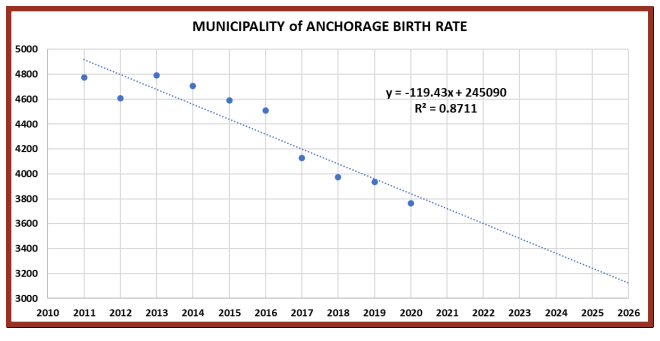
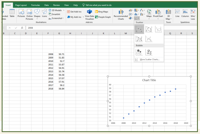
To illustrate, consider the following analysis of the actual birth rate data for Anchorage, Alaska, from 2011 to 2020. This resulting predictive equation reveals estimates for future age group cohorts and will be vital in planning for after school and camps in the community. The analysis presents an equation in which x is a year and y is the corresponding estimated population. For this example, notice the steady birth rate decline. What potential programming impacts could this have for camp and/or afterschool planning in Anchorage?
Upon visual inspection, the data from 2017 to 2020 appears to represent a closer relationship. Accordingly, following is a trend line equation that removes the other years.
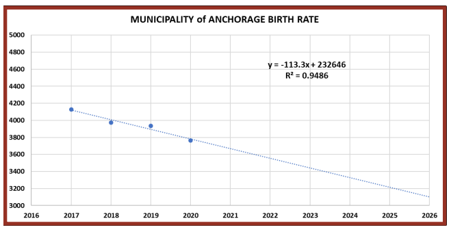
Notice the R2 value for this equation is closer to one, illustrating that this is a stronger predictive equation (i.e., .9486 vs. 8711). In short, R2 measures the strength of relationship between the dependent variable (birth rate) and independent variable (years). The closer this is to one, the better the equation represents the data and will yield improved projections. To obtain an estimate for births in any one year, you would simply enter a year for x into the equation. For instance, an approximation for 2022 through 2026 would yield the following:
f(2022) = -113.3 (2022) + 232646 = 3553.4 ≈ 3553
f(2023) = -113.3 (2023) + 232646 = 3440.1 ≈ 3440
f(2024) = -113.3 (2024) + 232646 = 3326.8 ≈ 3327
f(2025) = -113.3 (2025) + 232646 = 3213.5 ≈ 3214
f(2026) = -113.3 (2026) + 232646 = 3100.2 ≈ 3100.2
For planning, those born in 2022 will be enrolling in schools in 2027, and in summer 2032 they will be 10-year-old participants in Anchorage community programs and camps. The 2023 cohort will be nine, and the 2026 cohort will be six. With this predictive equation, you can estimate upcoming cohort sizes and future ones as well.
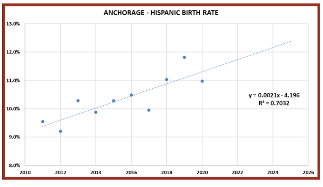
Reviewing the birth trends by race and ethnicity is also vital for program planning to ensure equity for all youth, teens, and families. Here is the trend equation for Hispanic births from 2011 to 2020. The fact that overall birth rates are declining while Hispanic birth rates are increasing could have important program planning implications, such as hiring additional bilingual staff and increasing the budget for Spanish language learning materials.
Creating a Predictive Equation Step by Step
Entering Your Data into Excel
Enter your historic data into two columns, by year and by value. Include chronological data in the left column and measured numbers or percentages in the right column. If you have a year-round program, you may want to complete month-by-month trends rather than annual only.
Charting the Data
Starting from the top-left cell, highlight all the data in both columns. Then click INSERT on the menu. Choose SCATTER in the chart-type drop-box.
Creating the Trend Equation
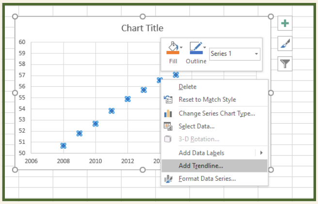
Click on one of the data points so all points are highlighted. With a PC, right-click. Choose ADD TRENDLINE.
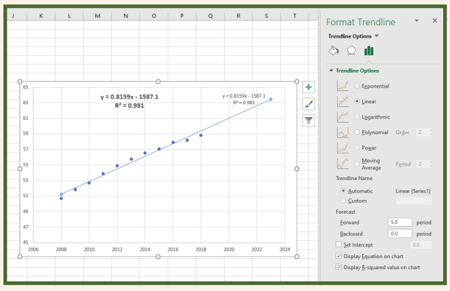
The Trendline menu will appear. Choose DISPLAY EQUATION ON CHART, DISPLAY R SQUARED VALUE ON CHART, and choose the number of forecast years you want in FORWARD.
Conducting an Equity Analysis
Determining if your camp is meeting the programming needs of all subgroups of your program population is vital for equity purposes. To ensure increased equity, you can integrate multilevel data disaggregation. By digging deeper into the layers of data, you will unearth the truth associated with program equity.
In 2014, the Annie E. Casey Foundation released Embracing Equity: 7 Steps to Advance and Embed Race Equity and Inclusion Within Your Organization, in which they recommended gathering and analyzing disaggregated data into race, gender, and other demographic variables. The United Nations recommends disaggregating indicators by income class, gender, ethnicity, geographic location, disability status, migration status, and other relevant dimensions (Asian Development Bank, 2021).
In Anchorage, where I live and work, 20 percent of the school district student population speak 110 languages. Accordingly, Camp Fire Alaska’s Anchorage-based afterschool and camp programs have extremely diverse participants. To evaluate programming from an equity perspective, we need to complete comprehensive multilevel disaggregation analyses to ensure we are meeting the needs and interests of all demographic subgroups.
To help illustrate the value of a multilevel disaggregation, consider some hypothetical program satisfaction data from a hypothetical ethnic group. For our purposes, envision that program participants had been surveyed using a 5-point Likert scale (i.e., 1 for “Greatly Disappointed” and a 5 for “Amazing, You Overdelivered”).
From the displayed result findings, this hypothetic ethnic group represented 12 percent of all campers at one camp location, and they had a collective satisfaction rate of 4.1 out of 5. On the surface, a 4.1 satisfaction rate sounds like a solid success. But is this the case? Are specific subgroups within this larger group less satisfied with the programming?
To complete a multilevel disaggregation, the ethnic group was first broken out by age/developmental levels (6–8, 9–11, 12–14) then by gender. From the following hypothetic results, what do you notice? What questions should the owner, administrator, program director, or staff members raise?
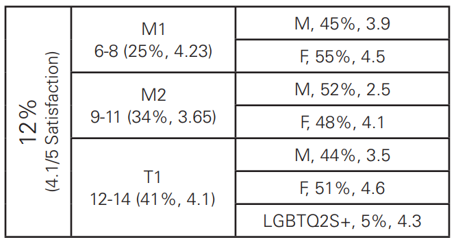
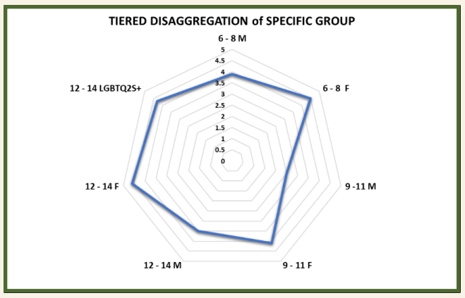
This multilevel breakdown reveals that 9- to 11-year-old boys in this ethnic group are the least satisfied with the programming. This should raise questions for leadership and staff. Everyone should reflect upon why these participants are less happy with programming and how it can be improved to meet the needs/interests of this subgroup.
With such a finding revealed, program leadership and staff should reach out to participants from this subgroup and their parents. Call the families, send out a survey, and/or create a focus group. Be vulnerable so your camp programming can meet the needs of all youth and teens in your camp.
Another equity analysis should be a multilevel disaggregation of your waitlist and current program participation demographic. Are there demographic differences between program participants and those on the waitlist? Your goal should always be to determine if your camp participants mirror the communities in the surrounding areas or the communities you draw from. Review community, county, state census, and school district data to help. Ask important additional questions. Does your staff reflect the community and camp participants? With the results of these equity analyses, you can think about how to improve equity of participants in your program. Keep in mind, the findings may impact your HR and marketing policies and procedures. For example, are your marketing and recruitment initiatives reaching specific underrepresented subgroup community members?
Visualization: How to Create a Radar Chart
Using a radar chart, you can create a visual representation of your camp’s analysis results to help staff see truths more clearly. To begin, extract your data from your multilevel disaggregation analysis and put it in the following format. Notice the age group and gender info is now combined.
|
6–8 M |
3.9 |
|
6–8 F |
4.5 |
|
9–1 M |
2.5 |
|
9–11 F |
4.1 |
|
12–14 M |
3.5 |
|
12–14 F |
4.6 |
|
12–14 LGBTQ2S+ |
4.3 |
Highlight these columns then choose INSERT + RADAR under all charts to display the data visually.
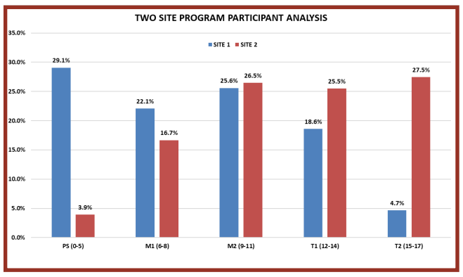
Program Patterns and Trends
By disaggregating your current program participation data based on age group, leadership and staff can analyze how the current campers will impact upcoming seasons. For example, I disaggregated the Rural Alaska Program at Camp Fire Alaska’s 2019 participation in two communities by the Center for Disease Control classifications (i.e., Preschoolers [0–5], Middle Childhood 1 [6–8], Middle Childhood 2 [9–11], Young Teens [12–14] and Teenagers [15–17]). When seeing this disaggregated information, what questions would you have?
When displaying the data visually and disaggregated, questions would organically emerge about why program participation is different in these two communities. The data offers an opportunity to reflect and reveal why this reality exists. Moreover, it will foster purposeful outreach efforts to learn more. Without such data, potential future campers could miss out.
Evaluation
Ripple Effects Mapping (REM) is a participatory appreciative inquiry-driven evaluation process (Chazdon et al., 2017). As a tool, REM provides an opportunity to unearth unintended consequences of programming impacts. Furthermore, the REM process paints a more holistic picture of program effects due to the varied perspectives shared by stakeholders.
- Pre-ripple Appreciative Open-ended Questions Development
Begin by developing appreciative open-ended questions for the different stakeholder groups. For a camp population, the following would yield valuable information:
Youth:
“As a result of attending camp this summer, how are you different?”
“What are you most proud of doing this summer?”
“What were you most excited about learning or doing this summer?”
Parent/Guardian:
“Do you notice any differences in your child as a result of attending camp this summer?”
“What accomplishments did your child share with you?”
“What was your child most excited about learning or doing this summer?”
Staff:
“As a result of camp participation, how are campers different?”
“Where did you see youth/teens proud of an accomplishment?”
“What were youth/teens most excited about learning/doing?”
“Of your contributions, what are you most proud of?” - Appreciative Inquiry Conversations (15–20 minutes)
After a brief introduction, organize stakeholders into groups of two. Instruct the pairs to interview one another with the relevant questions and to take notes. - Ripple Effects Mapping (45–75 minutes)
Have each pair share their learnings with the larger group, and write responses on a whiteboard or on poster paper. As connections are revealed, the facilitator links the shared responses visually in a mind map. - Reflection and Closing (15 minutes)
The facilitator will close by asking questions. “What is most interesting to you about this map?” “What surprises you about the information shared?” The completed mind map can then be digitized (MindMup, a free online program, is a useful tool for this purpose: mindmup.com).
Reveal
The final part of the PEPPER analysis model is a commitment to sharing findings with all staff, parents, and the board. Being open and honest about your strengths and weaknesses demonstrates a commitment to continual improvement. These data-driven findings should shape your short- and long-term vision and planning.
Joe Slowinski, M Ed, is the director of the Rural Alaska Program at Camp Fire Alaska. Over his more than 30-year career in youth development, he has served as a K-12 principal, K-12 director of student services, teacher trainer, teacher (middle, high, university), and NCAA/NAIA coach. Slowinski earned his M Ed in educational administration and supervision as well as a BA in mathematics and philosophy with a minor in computer science. He has penned more than 150 articles in educational policy, evaluation, instructional how-to, educational research, and sport-specific training content. His worldview has been shaped by living and working in the Americas, Africa, Asia, and Europe.
References
Accenture. (2019, August 29). Closing the Data Value Gap. accenture.com/us-en/insights/technology/closing-data-value-gap
Accenture. (2020, January 16). The human impact of data literacy. accenture.com/us-en/insights/technology/human-impact-data-literacy
Annie E. Casey Foundation. (2014). Embracing Equity: 7 Steps to Advance and Embed Race Equity and Inclusion Within Your Organization. ncfp.org/knowledge/embracing-equity-7-steps-to-advance-and-embed-race-equity-and-inclusion-within-your-organization/
Asian Development Bank. (2021, May). Practical Guidebook on Data Disaggregation for the Sustainable Development Goals. Manila, Philippines.
Brown, S. (2021, February 9). How to Build Data Literacy in Your Company. Ideas Made to Matter. MIT Sloan School of Management. mitsloan.mit.edu/ideas-made-to-matter/how-to-build-data-literacy-your-company
Brown, S. (2021b, September 16). It’s Time to ‘Radically Escalate’ Your Commitment to Data. Ideas Made to Matter. MIT Sloan School of Management. mitsloan.mit.edu/ideas-made-to-matter/its-time-to-radically-escalate-your-commitment-to-data
Center for the Study of Social Policy. (2021, September). Our Identities, Ourselves: An Anti-Racist Review on Collecting Accurate Data on Race and Ethnicity. cssp.org/wp-content/uploads/2021/09/Our-Identities-Ourselves-Literature-Review.pdf
Chazdon, S., Emery, M., Hansen, D., Higgins, L. & Sero, R. (2017). A Field Guide to Ripple Effects Mapping. Minneapolis: University of Minnesota Libraries Publishing.
Daniel, G. & Schlaseman, D. (2019, February 25). Win Big with Big Data: A Nonprofit’s Guide to Data Analytics. Philanthropy Journal. philanthropyjournal.com/win-big-with-big-data-a-nonprofits-guide-to-data-analytics/
Davenport, T., Smith, T., Guszsza, J. & Stiller, B. (2019, July 25). The Culture Catalyst: Analytics and AI-driven Enterprises Thrive in the Age of With. deloitte.com/us/en/insights/topics/analytics/insight-driven-organization.html
EveryAction & NonProfitHub. (2018). The State of Data in the Nonprofit Sector. cdn2.hubspot.net/hubfs/433841/The_State_of_Data_in_The_Nonprofit_Sector.pdf
Goasduff, L. (May 20, 2021). Data Sharing Is a Business Necessity to Accelerate Digital Business. gartner.com/smarterwithgartner/data-sharing-is-a-business-necessity-to-accelerate-digital-business
Hansen, D., Higgins, L. & Sero, R. (2018). Advanced Facilitator Guide for In-Depth Ripple Effects Mapping. Washington State University Extension.
Harvard Business Review Analytics Services. (2020). The New Decision Makers: Equipping Frontline Workers for Success. Research Report. Cambridge, MA.
Rome, C., Hansen, D., Sero, R. & Higgins, L. (2020, December). Using Data Visualization to Demonstrate Outcomes – Examples from Ripple Effects Mapping. Journal of Extension, 58 (6): 1-6.