Greetings Camp Evaluators! Today’s post is the first in a series built around ACA’s newest industry research: the 2017 Site, Facilities, and Programs Report. This is one of three reports ACA generates on a rotating basis, and each one of these research reports serves as the most robust data available on camp participation, programs, staffing, and budgeting. While Day- and Resident-specific reports are available for purchase, we will be sharing snapshots from this survey in the next several Research 360 blog posts. Use this information to help inform your program decisions, train staff, and advocate for your camp to parents, funders, and potential community partners.
The first post in this series is written by guest blogger Dr. Ann Gillard, Director of Research and Evaluation for Hole in the Wall Gang Camp, longtime camp researcher, ACA volunteer, and Camping Magazine author. Ann sets the stage for this short series by suggesting ways you can share the information in the Site, Facilities, and Programs report with your stakeholders.
So, you collected some data about your camp and now you want to tell people what you found – great! Maybe you have some satisfaction data about how many people liked your facility or activities, or maybe you have outcome data about changes in your campers. Either way, you have data! The next step is to communicate your results to others. But how?
First and foremost, focus on the “story” of your results — what story do they tell? Can you tell the story in one to two sentences? How about six words?
Camp folks are especially attuned to storytelling, so use this to your advantage. See your data as a story and not as a bunch of numbers. When you look at the numbers, what stands out to you? Finally, think about the people behind the numbers to get you started. Why is this number important for that group? So what?
Let’s work through some examples together. The most recent ACA Site and Facilities Report has some information about daily physical activity at camps.
Let’s take a look and discuss the good parts (in the white boxes) and the not-good parts (in the black boxes).
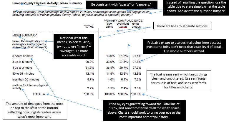
Bottom line: When I look at this chart, I have no idea what I should think. Help out your audience by highlighting the story these data tell. Is it important that rental groups seem to get a little less physical activity than day guests or overnight guests? Or is it important that 69% of day guests get 1-5 hours of physical activity? Or some other story?
A lot of camps get data that are best presented in a bar chart. [Side note: did you know that data are plural? A datum is singular, so use “data” as plural, such as “Data rock!”]. Bar charts are good for comparing values across categories, and will usually work for most results. The bar chart below is also from the ACA Site and Facilities Report. As bar charts go, it’s pretty good because it’s clean. But there are some things that could change.
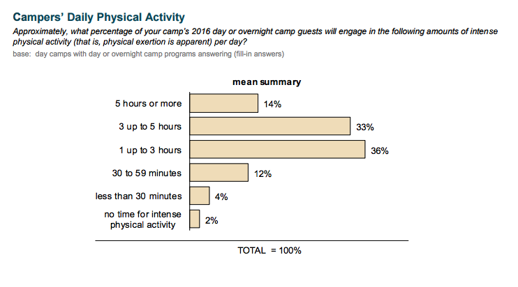
I redesigned this chart in Word and Excel 2016 on my PC. These tips apply to earlier versions of Office, too.
- Insert Chart, select Bar.
- Enter data, remembering when you’re in Excel to put the top category (5+ hours) at the bottom because Excel flips the data in the chart. Put the % after the number – that saves you a step later.
- Think about ways to reduce text, such as changing “5 hours or more” to “5+ hours.”
- Get rid of extra stuff: Delete the legend. Delete the vertical lines.
- Add data labels for the values. Place them at the inside end of the bars. Delete “Total = 100%.”
- Consider changing the “gap width” between bars. Below, my gap width is 30%, changed from the default of 100%.
- Think about what color you want to use for the bars and consider using 1-2 of your camp’s brand colors.
- Think about highlighting the story of your data with a different color to draw the eye toward something you want to stand out. Make sure your color choices are good for people with colorblindness. Here I used a darker blue and bolded the 2 percentages to highlight that 69% of guests at day camps spend between 1-5 hours in physical activity.
- Hey, that sounds like a good title! I bolded 69% and put it in the same color as the bars that stick out.
- I made a few other tweaks from the chart default, such as moving the charts to provide more white space (your best friend) under the title, changed font sizes, and moved the 2% over so it didn’t fall off the bar.
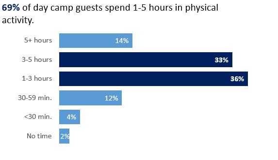
I don’t know if the meaningful story of these data is that “69% of day camp guests spend 1-5 hours in physical activity.” Maybe it’s some other story. Also, is 69% good or bad? It's unclear. Further, I’m not sure why this information would be interesting or useful to a camp. Not to get too off-topic, but designing good questions for surveys is very, very, very, very super-duper important. Always think about for what you will use the answers to the question. Ask yourself how knowing an answer to a particular question will help your camp or its people.
For fun, let’s say that the story of the first chart was to compare day, overnight, and rental group guests. Let’s use another bar chart, but this time let’s pair the data.
- Follow most of the directions from the first chart, making sure to delete extraneous text.
- Format data labels and add the percentage and series name.
- In Format Data Labels, delete the comma and choose a space as a separator between the label and the percentage.
- Change gap width back to 100%.
- Change fonts to be smaller so they fit on the bars better.
- Make the bar of interest a different color, increase font size, and bold.
- Make sure your colors are good for people with colorblindness.
- If you wanted, you could put a definition of “physical activity” as a text box in the white space in the bottom right of the chart, if that definition was important to understanding. Or, you could enter text in report above your chart to define your terms or participants. I’m not sure it’s important to define physical activity in this case, but there are options.
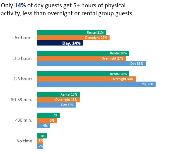
Again, I’m not sure that “Only 14% of day guests get 5+ hours of physical activity, less than overnight or rental group guests” is the meaningful story in this chart, but the chart offers another way to compare groups of data about different camp users.
Want to learn more about data visualization? There are many resources out there! Here are some of my favorite:
- Stephanie Evergreen’s blog
- Ann Emery’s blog
- Fresh Spectrum blog (lots of cartoons!)
- Cole Nussbaumer Knafflic’s blog
Ann Gillard, PhD, is the Director of Research and Evaluation at The Hole in the Wall Gang Camp. Ann has worked in camps and youth development for over 20 years.
Thanks to our research partner, Redwoods.

Additional thanks goes to our research supporter, Chaco.
The views and opinions expressed by contributors are their own and do not necessarily reflect the views of the American Camp Association or ACA employees.


