Greetings, camp evaluators! If you are a summer-only program, your camp season is well under way; in fact, you are might feel like you are rounding third and starting down the home stretch. For our year-round programs, you might already be thinking and planning for the next ball game.
Camp evaluation follows the camp seasons with periods of planning, execution, analysis, and back to planning. This cycle of plan-evaluate-act-reflect-plan is ongoing, whether you are a summer-only program or run programs fifty-two weeks a year.
It is always a good time to think about the information you have — your evaluation data. Today’s post is written by a familiar friend, Corey Newhouse from Public Profit. Corey’s previous Research 360 blog post challenged us to think of creative, camper-friendly ways to collect data. Today, Corey shares with us some easy, mid-summer ways you and your staff can begin to think about your data. Regardless of where you are in your camp evaluation cycle, there is always something to learn from the data you have in hand.
Here’s Corey:
Hi there! I’m Corey Newhouse, founder and principal of Public Profit.
These days, savvy camp managers know that they need to use data to inform ongoing planning and quality improvement processes. It can be tough to wade through the data on hand. Too often, when teams sit down to get clear about what their data is saying, they struggle to figure out what really matters and what do to next.
Use this three-step method to make more meaning of your data!
Scan
Start by getting a 10,000-foot view of your data. This will help your team to make better-informed decisions about which aspects of your program deserve a deeper dive.
Ask: Which of our measures are particularly high? Which are particularly low? What connections do we see among the high-rated measures, and the low?
For example, if your camp is not fully enrolled, youth surveys show kids are dissatisfied with the hands-on opportunities, and activity observations show limited opportunities for kids to interact with materials… you’ve got a pattern on your hands.
Once you’ve reviewed your data, pick one, maybe two, patterns to investigate further.
Check out Public Profit’s guide, Dabbling in the Data for fun team-based games to conduct your scan. High/Low and Mind the Gap are particularly useful.
Analyze
Now it’s time to figure out what’s driving the patterns you picked in the Scan phase. Push yourself and your team to get to the underlying reasons, since this will help you to identify specific, actionable issues to address.
A few of our favorite activities to do this include Five Whys and Iceberg Analysis. In Five Whys, state the pattern you observe, then ask “why?” five times. It’s a great way to get beyond surface observations.
Iceberg Analysis is similar. Draw an iceberg on chart paper. The tip of the iceberg is the thing you observe, the part of the iceberg that’s under the water are the factors driving that outcome. So the tip of your iceberg may be low enrollment, and what’s beneath are things like the mix of activities you offer, emotional safety, and opportunities for kids to lead.
Dabbling in the Data has other activities to consider for this phase, like Easy as Pie and Force Field Analysis.
Prioritize
Your team will need to focus on doing just a few things differently if you really want to change. Use what you learned from the Analyze phase to identify the highest value opportunities to make a lasting change.
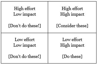
One way to do this is to use a Magic Quadrant. It’s a time-tested, easy way to sort through different options. In this case, we’ll use a Magic Quadrant to map our options based on how much effort they’ll take and how likely they are to have an impact. All you need is a chart paper, markers, and post-its.
Draw a table with four boxes. The upper right-hand box is for options that will take a lot of effort and will have a lot of impact. The lower right-hand box is for options that don’t take as much effort, but will have a lot of impact. Top left is for ideas with lots of effort and limited impact, and bottom left is for options with limited effort and limited impact.
Write the different options on post-it notes and put them on the appropriate part of the table. Disregard options on the left. For the options on the right, consider carefully the ones in the upper right hand corner (high effort, high impact) and definitely do the ones in the bottom right hand corner.
Download a free copy of Dabbling in the Data on the Public Profit web site.
Thanks for sticking with me! My company, Public Profit, helps youth service organizations be their best by making sense of their data. Former educators and youth workers ourselves, we’re passionate about helping our clients to measure and manage what matters. To learn more about our work, check out our web site: www.publicprofit.net or follow us on Twitter @public_profit
Corey Newhouse is the founder and principal of Public Profit.

A version of Corey Newhouse's blog post originally appeared here.
Photo courtesy of The Center for Courageous Kids in Scottsville, Kentucky
Thanks to our research partner, Redwoods.

Additional thanks goes to our research supporter, Chaco.
The views and opinions expressed by contributors are their own and do not necessarily reflect the views of the American Camp Association or ACA employees.


